Components
Coverage, variants, states, usage rules, visual consistency and ability to support product journeys.
A targeted engagement to assess the real consistency between design, code, documentation and team usage, then prioritise the fixes that make the Design System more useful day to day.

The audit helps understand why teams work around certain components, where decisions are no longer documented, and which gaps appear between mockups, the UI library, the code and accessibility.
The engagement can cover a component library, documentation, a Storybook, a Figma file, a few product journeys or a sample of production screens.
Coverage, variants, states, usage rules, visual consistency and ability to support product journeys.
Clarity of recommendations, examples, acceptance criteria, content, contribution and level of confidence for the teams.
Accessibility, tokens, recurring patterns, interface debt and gaps between the system's promise and the delivered screens.
Each recommendation links an observed problem to a concrete decision: fix a component, complete a rule, clarify a state, adjust a token or document a missing usage.
Choice of scope, sources to analyse and the friction points already identified by the teams.
Cross-reading of mockups, components, documentation, code and production screens.
Rank gaps by user impact, frequency of use and correction effort.
Final report, executable summary and discussion with the design, product or development teams.
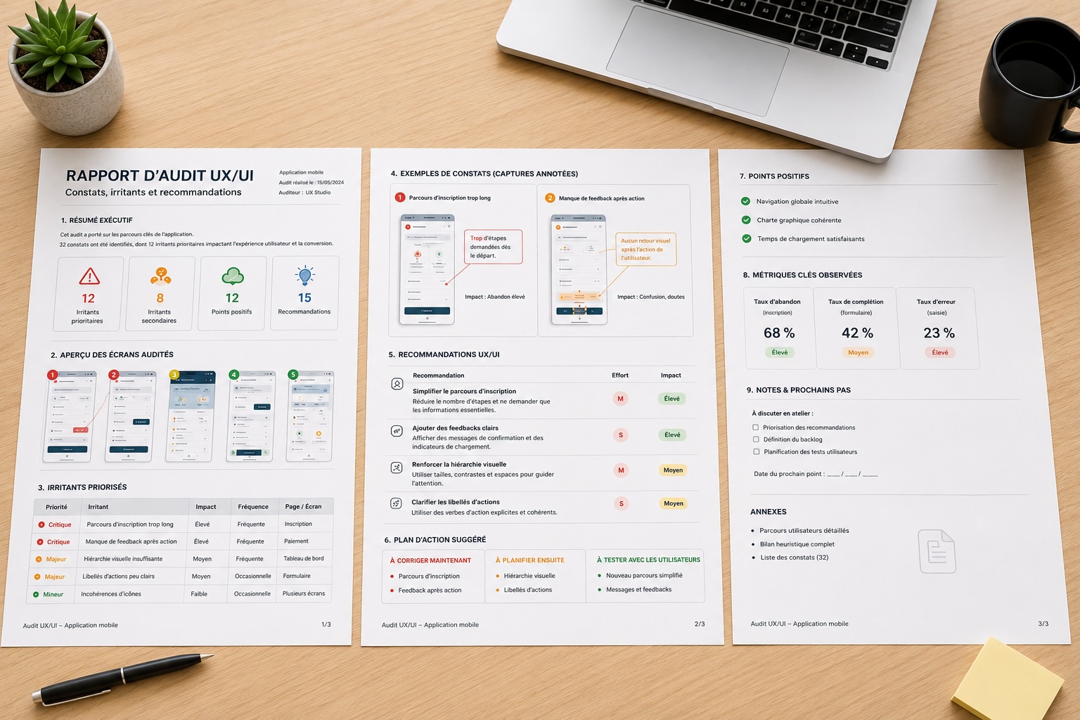
The report gathers findings, annotated screenshots, design/code gaps, usage risks and prioritised recommendations. It serves as support to arbitrate the Design System backlog and align teams on the next fixes.
Executive summary, usage recommendations, prioritisation and governance paths.