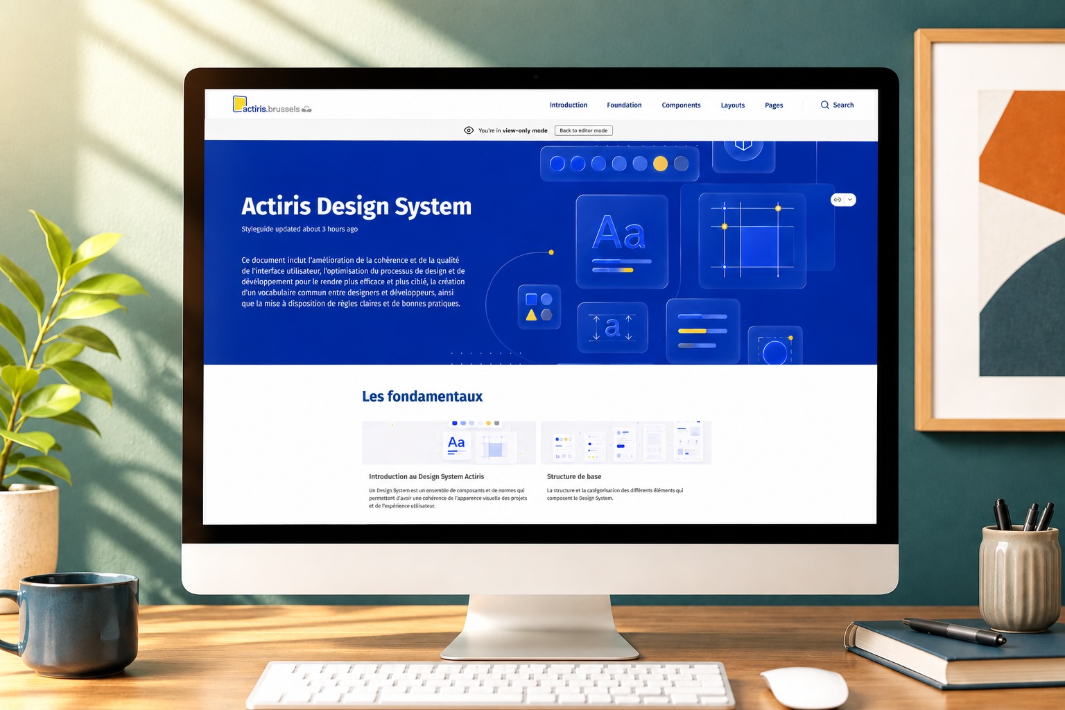
A Design System: the shared grammar of a digital product.
A Design System brings together the principles, components, usage rules and accessibility decisions that allow several teams to design the same product with the same language.
A Design System brings together the principles, components, usage rules and accessibility decisions that allow several teams to design the same product with the same language.
A Design System is a quality contract between design, code and business. It documents what must stay stable: colours, typography, spacing, components, behaviours, content, states, accessibility and best practices.
It helps an organisation move from building screens one by one to a coherent, maintainable product logic that is faster to evolve.
A Design System becomes useful when it answers very concrete problems: save time, avoid interpretations, secure quality and ease trade-offs.
Less time spent recreating the same patterns, more time to handle journeys, content, edge cases and usage quality.
Better-specified components, explicit states, usable documentation and fewer back-and-forths on interface details.
More readable decisions, a more consistent experience, more reliable products and a better ability to prioritise changes.
The Design System must cover the classics, but also make accessibility visible in every decision. WCAG recommendations should not arrive at the end of the project: they should be built into components, content and acceptance criteria.
Colour tokens, typography, spacing, grids, breakpoints, iconography, focus styles, elevations, motion and theming.
Buttons, forms, alerts, tables, navigation, modals, cards, tabs and business components with usages, variants, states and errors.
Contrasts, keyboard order, visible focus, accessible names, useful ARIA roles, alt text, clickable area sizes and zoom behaviour.
Labels, help messages, understandable errors, editorial tone, validation criteria, contribution process and decision tracking.
The right format depends less on the tool than on the organisation: who contributes, who consumes the documentation, which team maintains the components and what level of testing is expected.
Figma carries design and UI libraries. Storybook exposes coded components and their states. Zeroheight gathers principles, usage rules, UX decisions, WCAG recommendations and governance.
A format adapted to the client's technical stack, for example Bootstrap, Tailwind CSS, Material UI, Angular Material, Chakra UI or an internal framework. Its advantage: it is dynamic and allows testing components, their variants, states and accessibility directly.
I work on setting up the Design System, UX, accessibility, follow-up, documentation and collaboration with developers. My role is not to write the production HTML/CSS myself, but to frame what must be designed, documented, tested and implemented by the technical teams.
Analyse the existing: components, usages, design/code gaps, UX debt, accessibility and team needs.
Define the foundations, naming, priority components, usage rules and WCAG criteria.
Make each decision understandable for design, development, product and business teams.
Work with developers to validate behaviours, technical constraints and accessibility tests.
Set up governance, reviews, contribution rituals and quality monitoring over time.
A living Design System needs indicators. Audit and monitoring tools can track contrasts, accessibility regressions, component consistency, Storybook coverage, gaps between Figma and code or pages that drift from the standards.
UX/UI review, WCAG check, component audit and prioritisation of the fixes most visible to users.
Dashboards, automated tests, regression control and quality indicator tracking over time.
Contribution rituals, design/dev reviews, Design System backlog and acceptance criteria for each change.