Showcase site
Promise, page structure, content readability, message hierarchy, calls to action and perceived credibility.
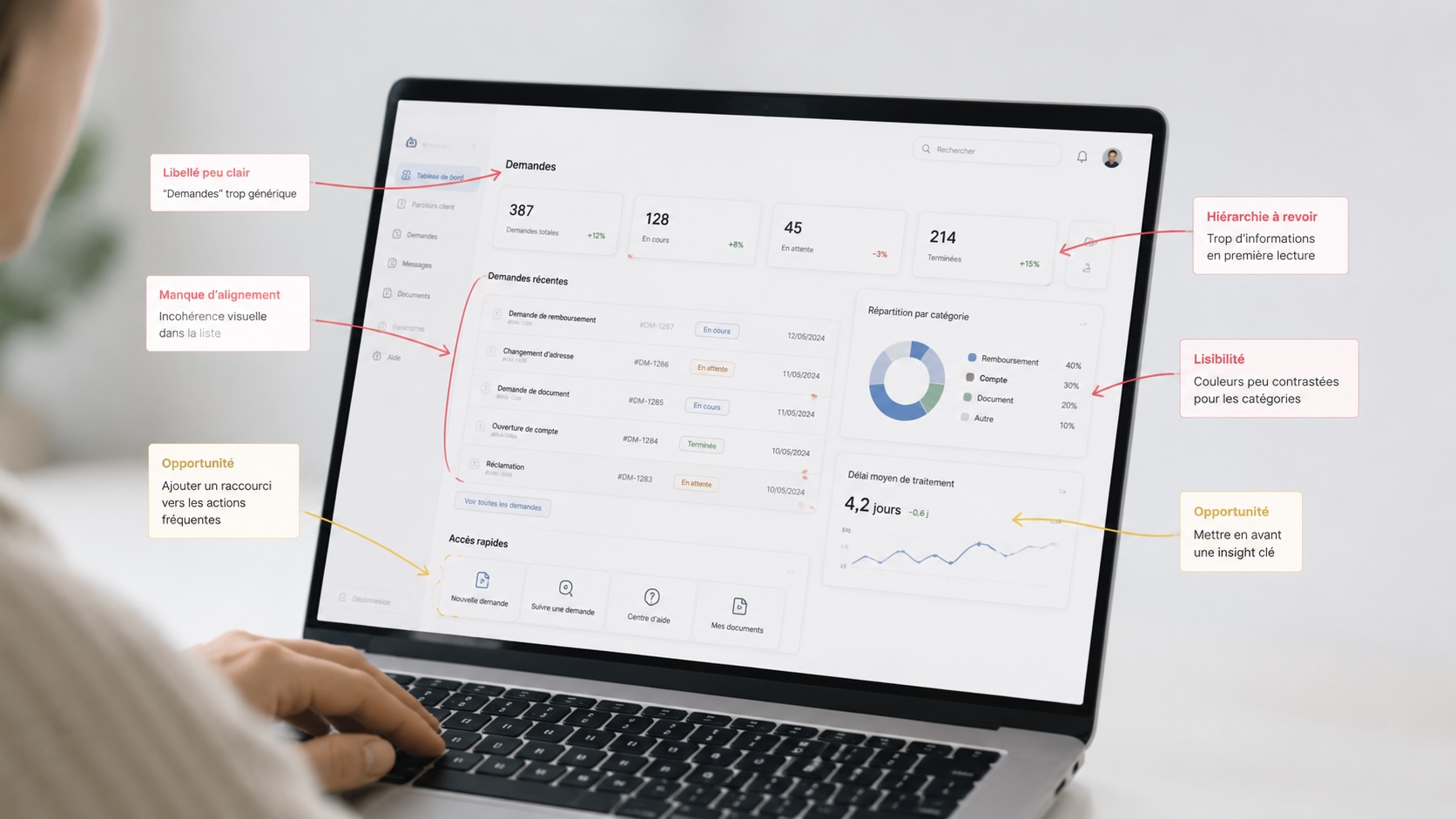
An expert eye to spot graphic inconsistencies, friction zones, vague content and navigation problems that hinder understanding, conversion or daily use.
A showcase site can lose its visitor with a vague promise. An e-commerce store can create hesitation at the moment of choice or payment. A business application can slow teams down with dense screens, imprecise labels or inconsistent journeys.
The analysis can cover a few strategic screens or a complete journey, depending on your business, product or user priorities.
Promise, page structure, content readability, message hierarchy, calls to action and perceived credibility.
Catalogue navigation, product page, reassurance, checkout funnel, micro-content, visual consistency and conversion barriers.
Business journeys, dashboards, forms, screen states, deep navigation, terminology and cognitive load.
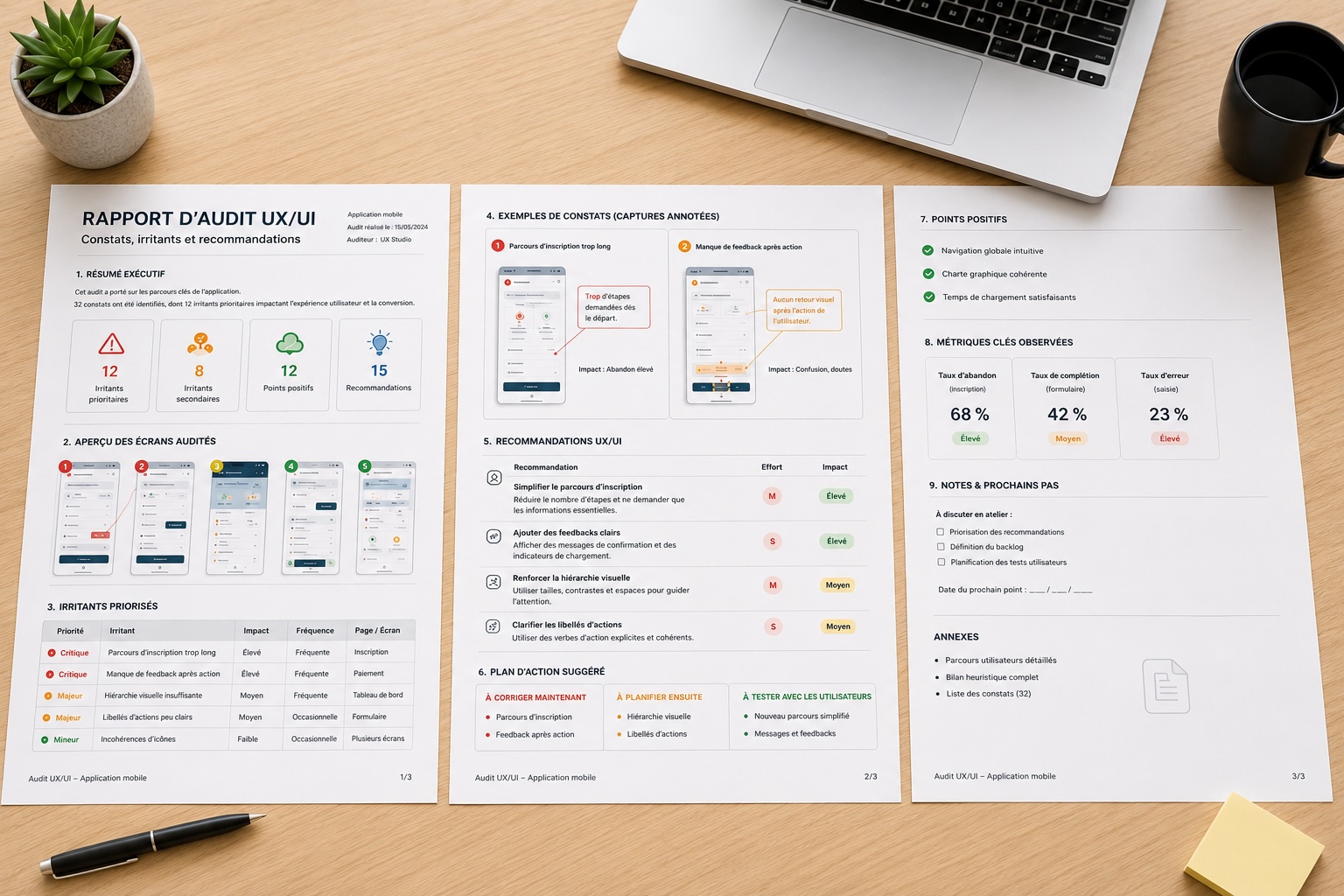
The goal is not to produce an abstract list of remarks, but to explain what blocks, why it blocks and how to improve the user experience.
Define the scope, the pages or screens to audit, the objectives and the priority journeys.
UX/UI analysis of screens, navigation, content, visual consistency and friction points.
Rank issues by their impact on understanding, conversion, efficiency or trust.
Concrete proposals: rewording, journey simplification, visual hierarchy, components, states and actions.
Present the report, explain the trade-offs and implementation paths with your teams.
Each point is documented with a finding, its likely impact on the user and a directly actionable improvement path.
Style variations, confusing hierarchies, unstable components, contrasts, alignments and breaks in visual language.
Generic titles, imprecise labels, missing help text, lack of reassurance or key information that is too hard to find.
Ambiguous menus, competing actions, unnecessary steps, costly back-tracking and lack of landmarks in the journey.
The deliverable gathers findings, annotated screenshots, prioritised friction points and UX/UI recommendations. It serves as a working basis to decide what to fix now, what to plan next and what to test with users.
Structured report with concrete improvement paths, prioritisation and executive summary.